
Page 316 - Python Data Science Handbook
P. 316
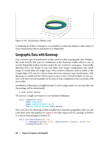
Figure 4-101. Visualizing a Möbius strip

               Combining all of these techniques, it is possible to create and display a wide variety of
               three-dimensional objects and patterns in Matplotlib.

               Geographic Data with Basemap


               One common type of visualization in data science is that of geographic data. Matplot‐
               lib’s main tool for this type of visualization is the Basemap toolkit, which is one of
               several Matplotlib toolkits that live under the mpl_toolkits namespace. Admittedly,
               Basemap feels a bit clunky to use, and often even simple visualizations take much
               longer to render than you might hope. More modern solutions, such as leaflet or the
               Google Maps API, may be a better choice for more intensive map visualizations. Still,
               Basemap is a useful tool for Python users to have in their virtual toolbelts. In this sec‐
               tion, we’ll show several examples of the type of map visualization that is possible with
               this toolkit.
               Installation of Basemap is straightforward; if you’re using conda you can type this and
               the package will be downloaded:

                   $ conda install basemap
               We add just a single new import to our standard boilerplate:

                   In[1]: %matplotlib inline
                          import numpy as np
                          import matplotlib.pyplot as plt
                          from mpl_toolkits.basemap import Basemap
               Once you have the Basemap toolkit installed and imported, geographic plots are just
               a few lines away (the graphics in Figure 4-102 also require the PIL package in Python
               2, or the pillow package in Python 3):
                   In[2]: plt.figure(figsize=(8, 8))
                          m = Basemap(projection='ortho', resolution=None, lat_0=50, lon_0=-100)
                          m.bluemarble(scale=0.5);


               298  |  Chapter 4: Visualization with Matplotlib