Page 326 - Python Data Science Handbook
P. 326
Example: California Cities

               Recall that in “Customizing Plot Legends” on page 249, we demonstrated the use of
               size and color in a scatter plot to convey information about the location, size, and
               population of California cities. Here, we’ll create this plot again, but using Basemap to
               put the data in context.
               We start with loading the data, as we did before:

                   In[10]: import pandas as pd
                           cities = pd.read_csv('data/california_cities.csv')

                           # Extract the data we're interested in
                           lat = cities['latd'].values
                           lon = cities['longd'].values
                           population = cities['population_total'].values
                           area = cities['area_total_km2'].values
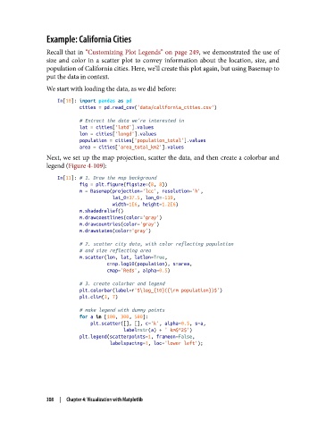
               Next, we set up the map projection, scatter the data, and then create a colorbar and
               legend (Figure 4-109):

                   In[11]: # 1. Draw the map background
                           fig = plt.figure(figsize=(8, 8))
                           m = Basemap(projection='lcc', resolution='h',
                                       lat_0=37.5, lon_0=-119,
                                       width=1E6, height=1.2E6)
                           m.shadedrelief()
                           m.drawcoastlines(color='gray')
                           m.drawcountries(color='gray')
                           m.drawstates(color='gray')
                           # 2. scatter city data, with color reflecting population
                           # and size reflecting area
                           m.scatter(lon, lat, latlon=True,
                                     c=np.log10(population), s=area,
                                     cmap='Reds', alpha=0.5)
                           # 3. create colorbar and legend
                           plt.colorbar(label=r'$\log_{10}({\rm population})$')
                           plt.clim(3, 7)
                           # make legend with dummy points
                           for a in [100, 300, 500]:
                               plt.scatter([], [], c='k', alpha=0.5, s=a,
                                           label=str(a) + ' km$^2$')
                           plt.legend(scatterpoints=1, frameon=False,
                                      labelspacing=1, loc='lower left');


               308  |  Chapter 4: Visualization with Matplotlib

