
Page 328 - Python Data Science Handbook
P. 328
We read the data as follows:
In[13]: from netCDF4 import Dataset
data = Dataset('gistemp250.nc')
The file contains many global temperature readings on a variety of dates; we need to
select the index of the date we’re interested in—in this case, January 15, 2014:
In[14]: from netCDF4 import date2index
from datetime import datetime
timeindex = date2index(datetime(2014, 1, 15),
data.variables['time'])
Now we can load the latitude and longitude data, as well as the temperature anomaly
for this index:
In[15]: lat = data.variables['lat'][:]
lon = data.variables['lon'][:]
lon, lat = np.meshgrid(lon, lat)
temp_anomaly = data.variables['tempanomaly'][timeindex]
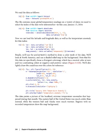
Finally, we’ll use the pcolormesh() method to draw a color mesh of the data. We’ll
look at North America, and use a shaded relief map in the background. Note that for
this data we specifically chose a divergent colormap, which has a neutral color at zero
and two contrasting colors at negative and positive values (Figure 4-110). We’ll also
lightly draw the coastlines over the colors for reference:
In[16]: fig = plt.figure(figsize=(10, 8))
m = Basemap(projection='lcc', resolution='c',
width=8E6, height=8E6,
lat_0=45, lon_0=-100,)
m.shadedrelief(scale=0.5)
m.pcolormesh(lon, lat, temp_anomaly,
latlon=True, cmap='RdBu_r')
plt.clim(-8, 8)
m.drawcoastlines(color='lightgray')
plt.title('January 2014 Temperature Anomaly')
plt.colorbar(label='temperature anomaly (°C)');
The data paints a picture of the localized, extreme temperature anomalies that hap‐
pened during that month. The eastern half of the United States was much colder than
normal, while the western half and Alaska were much warmer. Regions with no
recorded temperature show the map background.
310 | Chapter 4: Visualization with Matplotlib