
Page 329 - Python Data Science Handbook
P. 329
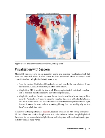
Figure 4-110. The temperature anomaly in January 2014

               Visualization with Seaborn


               Matplotlib has proven to be an incredibly useful and popular visualization tool, but
               even avid users will admit it often leaves much to be desired. There are several valid
               complaints about Matplotlib that often come up:
                 • Prior to version 2.0, Matplotlib’s defaults are not exactly the best choices. It was
                   based off of MATLAB circa 1999, and this often shows.
                 • Matplotlib’s API is relatively low level. Doing sophisticated statistical visualiza‐
                   tion is possible, but often requires a lot of boilerplate code.
                 • Matplotlib predated Pandas by more than a decade, and thus is not designed for
                   use with Pandas DataFrames. In order to visualize data from a Pandas DataFrame,
                   you must extract each Series and often concatenate them together into the right
                   format. It would be nicer to have a plotting library that can intelligently use the
                   DataFrame labels in a plot.

               An answer to these problems is Seaborn. Seaborn provides an API on top of Matplot‐
               lib that offers sane choices for plot style and color defaults, defines simple high-level
               functions for common statistical plot types, and integrates with the functionality pro‐
               vided by Pandas DataFrames.


                                                                 Visualization with Seaborn  |  311