
Page 327 - Python Data Science Handbook
P. 327
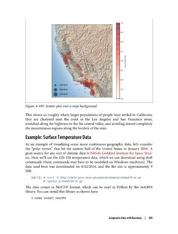
Figure 4-109. Scatter plot over a map background

               This shows us roughly where larger populations of people have settled in California:
               they are clustered near the coast in the Los Angeles and San Francisco areas,
               stretched along the highways in the flat central valley, and avoiding almost completely
               the mountainous regions along the borders of the state.

               Example: Surface Temperature Data

               As an example of visualizing some more continuous geographic data, let’s consider
               the “polar vortex” that hit the eastern half of the United States in January 2014. A
               great source for any sort of climatic data is NASA’s Goddard Institute for Space Stud‐
               ies. Here we’ll use the GIS 250 temperature data, which we can download using shell
               commands (these commands may have to be modified on Windows machines). The
               data used here was downloaded on 6/12/2016, and the file size is approximately 9
               MB:
                   In[12]: # !curl -O http://data.giss.nasa.gov/pub/gistemp/gistemp250.nc.gz
                           # !gunzip gistemp250.nc.gz

               The data comes in NetCDF format, which can be read in Python by the netCDF4
               library. You can install this library as shown here:
                   $ conda install netcdf4


                                                               Geographic Data with Basemap  |  309