
Page 330 - Python Data Science Handbook
P. 330
To be fair, the Matplotlib team is addressing this: it has recently added the plt.style
tools (discussed in “Customizing Matplotlib: Configurations and Stylesheets” on page
282), and is starting to handle Pandas data more seamlessly. The 2.0 release of the
library will include a new default stylesheet that will improve on the current status
quo. But for all the reasons just discussed, Seaborn remains an extremely useful
add-on.
Seaborn Versus Matplotlib
Here is an example of a simple random-walk plot in Matplotlib, using its classic plot
formatting and colors. We start with the typical imports:
In[1]: import matplotlib.pyplot as plt
plt.style.use('classic')
%matplotlib inline
import numpy as np
import pandas as pd
Now we create some random walk data:
In[2]: # Create some data
rng = np.random.RandomState(0)
x = np.linspace(0, 10, 500)
y = np.cumsum(rng.randn(500, 6), 0)
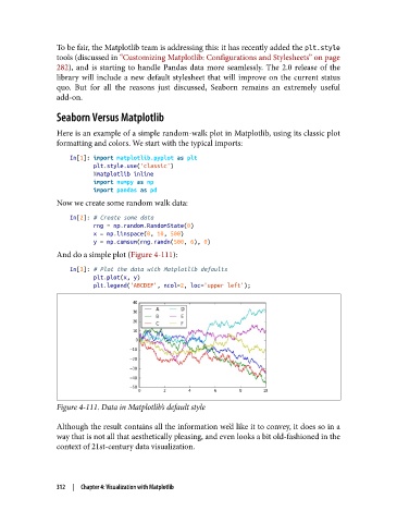
And do a simple plot (Figure 4-111):
In[3]: # Plot the data with Matplotlib defaults
plt.plot(x, y)
plt.legend('ABCDEF', ncol=2, loc='upper left');
Figure 4-111. Data in Matplotlib’s default style
Although the result contains all the information we’d like it to convey, it does so in a
way that is not all that aesthetically pleasing, and even looks a bit old-fashioned in the
context of 21st-century data visualization.
312 | Chapter 4: Visualization with Matplotlib