
Page 332 - Python Data Science Handbook
P. 332
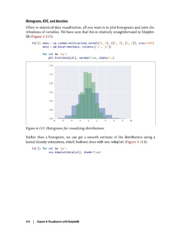
Histograms, KDE, and densities

               Often in statistical data visualization, all you want is to plot histograms and joint dis‐
               tributions of variables. We have seen that this is relatively straightforward in Matplot‐
               lib (Figure 4-113):
                   In[6]: data = np.random.multivariate_normal([0, 0], [[5, 2], [2, 2]], size=2000)
                          data = pd.DataFrame(data, columns=['x', 'y'])
                          for col in 'xy':
                              plt.hist(data[col], normed=True, alpha=0.5)


               Figure 4-113. Histograms for visualizing distributions

               Rather than a histogram, we can get a smooth estimate of the distribution using a
               kernel density estimation, which Seaborn does with sns.kdeplot (Figure 4-114):

                   In[7]: for col in 'xy':
                              sns.kdeplot(data[col], shade=True)


               314  |  Chapter 4: Visualization with Matplotlib