
Page 333 - Python Data Science Handbook
P. 333
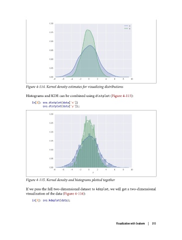
Figure 4-114. Kernel density estimates for visualizing distributions

               Histograms and KDE can be combined using distplot (Figure 4-115):

                   In[8]: sns.distplot(data['x'])
                          sns.distplot(data['y']);


               Figure 4-115. Kernel density and histograms plotted together

               If we pass the full two-dimensional dataset to kdeplot, we will get a two-dimensional
               visualization of the data (Figure 4-116):
                   In[9]: sns.kdeplot(data);


                                                                 Visualization with Seaborn  |  315