
Page 339 - Python Data Science Handbook
P. 339
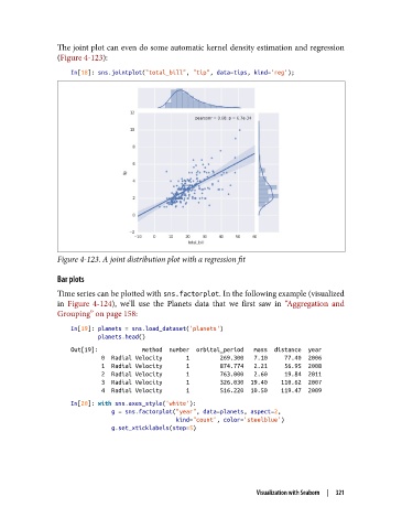
The joint plot can even do some automatic kernel density estimation and regression
               (Figure 4-123):

                   In[18]: sns.jointplot("total_bill", "tip", data=tips, kind='reg');


               Figure 4-123. A joint distribution plot with a regression fit

               Bar plots
               Time series can be plotted with sns.factorplot. In the following example (visualized
               in Figure 4-124), we’ll use the Planets data that we first saw in “Aggregation and
               Grouping” on page 158:

                   In[19]: planets = sns.load_dataset('planets')
                           planets.head()
                   Out[19]:             method  number  orbital_period   mass  distance  year
                            0  Radial Velocity       1         269.300   7.10     77.40  2006
                            1  Radial Velocity       1         874.774   2.21     56.95  2008
                            2  Radial Velocity       1         763.000   2.60     19.84  2011
                            3  Radial Velocity       1         326.030  19.40    110.62  2007
                            4  Radial Velocity       1         516.220  10.50    119.47  2009
                   In[20]: with sns.axes_style('white'):
                               g = sns.factorplot("year", data=planets, aspect=2,
                                                  kind="count", color='steelblue')
                               g.set_xticklabels(step=5)


                                                                 Visualization with Seaborn  |  321