
Page 87 - Python Data Science Handbook
P. 87
monly seen example is centering an array of data. Imagine you have an array of 10
observations, each of which consists of 3 values. Using the standard convention (see
“Data Representation in Scikit-Learn” on page 343), we’ll store this in a 10×3 array:
In[17]: X = np.random.random((10, 3))
We can compute the mean of each feature using the mean aggregate across the first
dimension:
In[18]: Xmean = X.mean(0)
Xmean
Out[18]: array([ 0.53514715, 0.66567217, 0.44385899])
And now we can center the X array by subtracting the mean (this is a broadcasting
operation):
In[19]: X_centered = X - Xmean
To double-check that we’ve done this correctly, we can check that the centered array
has near zero mean:
In[20]: X_centered.mean(0)
Out[20]: array([ 2.22044605e-17, -7.77156117e-17, -1.66533454e-17])
To within-machine precision, the mean is now zero.
Plotting a two-dimensional function
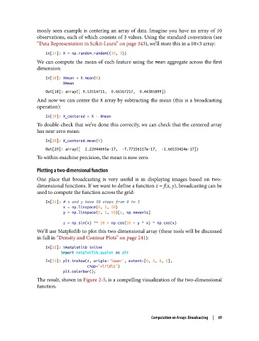
One place that broadcasting is very useful is in displaying images based on two-
dimensional functions. If we want to define a function z = f(x, y), broadcasting can be
used to compute the function across the grid:
In[21]: # x and y have 50 steps from 0 to 5
x = np.linspace(0, 5, 50)
y = np.linspace(0, 5, 50)[:, np.newaxis]
z = np.sin(x) ** 10 + np.cos(10 + y * x) * np.cos(x)
We’ll use Matplotlib to plot this two-dimensional array (these tools will be discussed
in full in “Density and Contour Plots” on page 241):
In[22]: %matplotlib inline
import matplotlib.pyplot as plt
In[23]: plt.imshow(z, origin='lower', extent=[0, 5, 0, 5],
cmap='viridis')
plt.colorbar();
The result, shown in Figure 2-5, is a compelling visualization of the two-dimensional
function.
Computation on Arrays: Broadcasting | 69