
Page 16 - Computing book 6
P. 16
Analysing Data Class 6
Add Data Labels to a Chart:
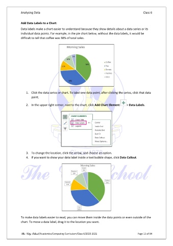
Data labels make a chart easier to understand because they show details about a data series or its
individual data points. For example, in the pie chart below, without the data labels, it would be
difficult to tell that coffee was 38% of total sales.
1. Click the data series or chart. To label one data point, after clicking the series, click that data
point.
2. In the upper right corner, next to the chart, click Add Chart Element > Data Labels.
3. To change the location, click the arrow, and choose an option.
4. If you want to show your data label inside a text bubble shape, click Data Callout.
To make data labels easier to read, you can move them inside the data points or even outside of the
chart. To move a data label, drag it to the location you want.
The City School /Academics/Computing Curriculum/Class 6/2020-2021 Page 15 of 94