
Page 17 - Computing book 6
P. 17
Analysing Data Class 6
Excel allows you to add chart elements such as chart titles, legends, and data labels to make your
chart easier to read. To add a chart element, click the Add Chart Element command on the Design
tab, then choose the desired element from the drop-down menu.
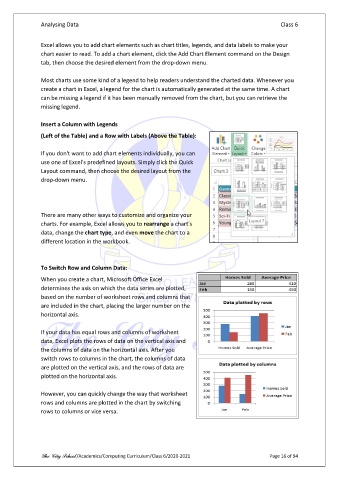
Most charts use some kind of a legend to help readers understand the charted data. Whenever you
create a chart in Excel, a legend for the chart is automatically generated at the same time. A chart
can be missing a legend if it has been manually removed from the chart, but you can retrieve the
missing legend.
Insert a Column with Legends
(Left of the Table) and a Row with Labels (Above the Table):
If you don't want to add chart elements individually, you can
use one of Excel's predefined layouts. Simply click the Quick
Layout command, then choose the desired layout from the
drop-down menu.
There are many other ways to customize and organize your
charts. For example, Excel allows you to rearrange a chart's
data, change the chart type, and even move the chart to a
different location in the workbook.
To Switch Row and Column Data:
When you create a chart, Microsoft Office Excel
determines the axis on which the data series are plotted,
based on the number of worksheet rows and columns that
are included in the chart, placing the larger number on the
horizontal axis.
If your data has equal rows and columns of worksheet
data, Excel plots the rows of data on the vertical axis and
the columns of data on the horizontal axis. After you
switch rows to columns in the chart, the columns of data
are plotted on the vertical axis, and the rows of data are
plotted on the horizontal axis.
However, you can quickly change the way that worksheet
rows and columns are plotted in the chart by switching
rows to columns or vice versa.
The City School /Academics/Computing Curriculum/Class 6/2020-2021 Page 16 of 94