
Page 47 - Computing Book 4
P. 47
Spreadsheet Formatting Class 4
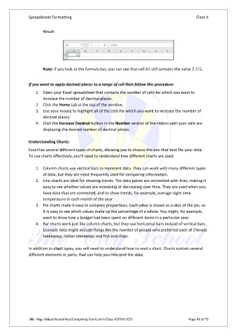
Result:
Note: if you look at the formula bar, you can see that cell A1 still contains the value 2.175.
If you want to apply decimal places to a range of cell then follow this procedure:
1. Open your Excel spreadsheet that contains the number of cells for which you want to
increase the number of decimal places.
2. Click the Home tab at the top of the window.
3. Use your mouse to highlight all of the cells for which you want to increase the number of
decimal places.
4. Click the Increase Decimal button in the Number section of the ribbon until your cells are
displaying the desired number of decimal places.
Understanding Charts:
Excel has several different types of charts, allowing you to choose the one that best fits your data.
To use charts effectively, you'll need to understand how different charts are used.
1. Column charts use vertical bars to represent data. They can work with many different types
of data, but they are most frequently used for comparing information.
2. Line charts are ideal for showing trends. The data points are connected with lines, making it
easy to see whether values are increasing or decreasing over time. They are used when you
have data that are connected, and to show trends, for example, average night time
temperature in each month of the year.
3. Pie charts make it easy to compare proportions. Each value is shown as a slice of the pie, so
it is easy to see which values make up the percentage of a whole. You might, for example,
want to show how a budget had been spent on different items in a particular year.
4. Bar charts work just like column charts, but they use horizontal bars instead of vertical bars.
Example data might include things like the number of people who preferred each of Chinese
takeaways, Indian takeaways and fish and chips.
In addition to chart types, you will need to understand how to read a chart. Charts contain several
different elements or parts, that can help you interpret the data.
The City School /Academics/Computing Curriculum/Class 4/2020-2021 Page 46 of 73