
Page 254 - Python Data Science Handbook
P. 254
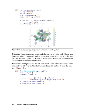
In[7]: rng = np.random.RandomState(0)
                          x = rng.randn(100)
                          y = rng.randn(100)
                          colors = rng.rand(100)
                          sizes = 1000 * rng.rand(100)
                          plt.scatter(x, y, c=colors, s=sizes, alpha=0.3,
                                      cmap='viridis')
                          plt.colorbar();  # show color scale


               Figure 4-25. Changing size, color, and transparency in scatter points

               Notice that the color argument is automatically mapped to a color scale (shown here
               by the colorbar() command), and the size argument is given in pixels. In this way,
               the color and size of points can be used to convey information in the visualization, in
               order to illustrate multidimensional data.
               For example, we might use the Iris data from Scikit-Learn, where each sample is one
               of three types of flowers that has had the size of its petals and sepals carefully meas‐
               ured (Figure 4-26):

                   In[8]: from sklearn.datasets import load_iris
                          iris = load_iris()
                          features = iris.data.T

                          plt.scatter(features[0], features[1], alpha=0.2,
                                      s=100*features[3], c=iris.target, cmap='viridis')
                          plt.xlabel(iris.feature_names[0])
                          plt.ylabel(iris.feature_names[1]);


               236  |  Chapter 4: Visualization with Matplotlib