
Page 251 - Python Data Science Handbook
P. 251
Simple Scatter Plots
Another commonly used plot type is the simple scatter plot, a close cousin of the line
plot. Instead of points being joined by line segments, here the points are represented
individually with a dot, circle, or other shape. We’ll start by setting up the notebook
for plotting and importing the functions we will use:
In[1]: %matplotlib inline
import matplotlib.pyplot as plt
plt.style.use('seaborn-whitegrid')
import numpy as np
Scatter Plots with plt.plot
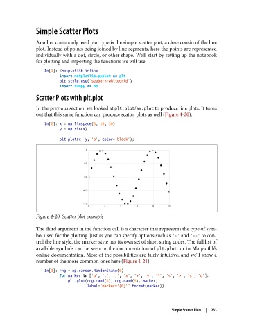
In the previous section, we looked at plt.plot/ax.plot to produce line plots. It turns
out that this same function can produce scatter plots as well (Figure 4-20):
In[2]: x = np.linspace(0, 10, 30)
y = np.sin(x)
plt.plot(x, y, 'o', color='black');
Figure 4-20. Scatter plot example
The third argument in the function call is a character that represents the type of sym‐
bol used for the plotting. Just as you can specify options such as '-' and '--' to con‐
trol the line style, the marker style has its own set of short string codes. The full list of
available symbols can be seen in the documentation of plt.plot, or in Matplotlib’s
online documentation. Most of the possibilities are fairly intuitive, and we’ll show a
number of the more common ones here (Figure 4-21):
In[3]: rng = np.random.RandomState(0)
for marker in ['o', '.', ',', 'x', '+', 'v', '^', '<', '>', 's', 'd']:
plt.plot(rng.rand(5), rng.rand(5), marker,
label="marker='{0}'".format(marker))
Simple Scatter Plots | 233