
Page 256 - Python Data Science Handbook
P. 256
Suppose I augment this information with reported uncertainties: the current litera‐
ture suggests a value of around 71 ± 2.5 (km/s)/Mpc, and my method has measured a
value of 74 ± 5 (km/s)/Mpc. Now are the values consistent? That is a question that
can be quantitatively answered.
In visualization of data and results, showing these errors effectively can make a plot
convey much more complete information.
Basic Errorbars
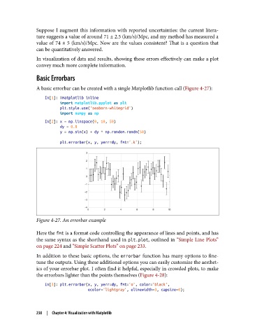
A basic errorbar can be created with a single Matplotlib function call (Figure 4-27):
In[1]: %matplotlib inline
import matplotlib.pyplot as plt
plt.style.use('seaborn-whitegrid')
import numpy as np
In[2]: x = np.linspace(0, 10, 50)
dy = 0.8
y = np.sin(x) + dy * np.random.randn(50)
plt.errorbar(x, y, yerr=dy, fmt='.k');
Figure 4-27. An errorbar example
Here the fmt is a format code controlling the appearance of lines and points, and has
the same syntax as the shorthand used in plt.plot, outlined in “Simple Line Plots”
on page 224 and “Simple Scatter Plots” on page 233.
In addition to these basic options, the errorbar function has many options to fine-
tune the outputs. Using these additional options you can easily customize the aesthet‐
ics of your errorbar plot. I often find it helpful, especially in crowded plots, to make
the errorbars lighter than the points themselves (Figure 4-28):
In[3]: plt.errorbar(x, y, yerr=dy, fmt='o', color='black',
ecolor='lightgray', elinewidth=3, capsize=0);
238 | Chapter 4: Visualization with Matplotlib