
Page 249 - Python Data Science Handbook
P. 249
plt.xlabel("x")
plt.ylabel("sin(x)");
Figure 4-17. Examples of axis labels and title
You can adjust the position, size, and style of these labels using optional arguments to
the function. For more information, see the Matplotlib documentation and the doc‐
strings of each of these functions.
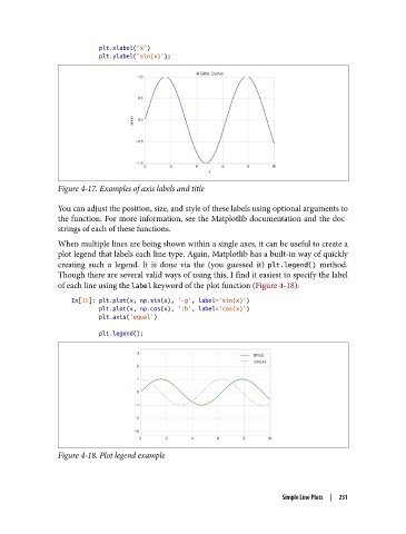
When multiple lines are being shown within a single axes, it can be useful to create a
plot legend that labels each line type. Again, Matplotlib has a built-in way of quickly
creating such a legend. It is done via the (you guessed it) plt.legend() method.
Though there are several valid ways of using this, I find it easiest to specify the label
of each line using the label keyword of the plot function (Figure 4-18):
In[15]: plt.plot(x, np.sin(x), '-g', label='sin(x)')
plt.plot(x, np.cos(x), ':b', label='cos(x)')
plt.axis('equal')
plt.legend();
Figure 4-18. Plot legend example
Simple Line Plots | 231