
Page 257 - Python Data Science Handbook
P. 257
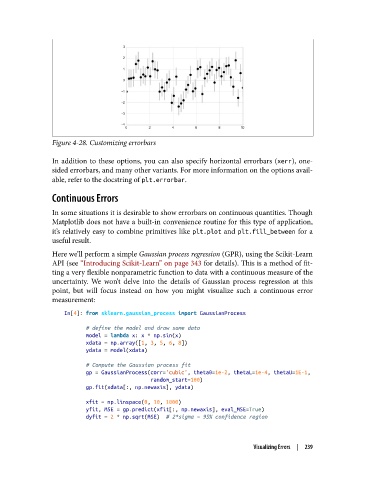
Figure 4-28. Customizing errorbars

               In addition to these options, you can also specify horizontal errorbars (xerr), one-
               sided errorbars, and many other variants. For more information on the options avail‐
               able, refer to the docstring of plt.errorbar.

               Continuous Errors

               In some situations it is desirable to show errorbars on continuous quantities. Though
               Matplotlib does not have a built-in convenience routine for this type of application,
               it’s relatively easy to combine primitives like plt.plot  and plt.fill_between  for a
               useful result.

               Here we’ll perform a simple Gaussian process regression (GPR), using the Scikit-Learn
               API (see “Introducing Scikit-Learn” on page 343 for details). This is a method of fit‐
               ting a very flexible nonparametric function to data with a continuous measure of the
               uncertainty. We won’t delve into the details of Gaussian process regression at this
               point, but will focus instead on how you might visualize such a continuous error
               measurement:
                   In[4]: from sklearn.gaussian_process import GaussianProcess

                          # define the model and draw some data
                          model = lambda x: x * np.sin(x)
                          xdata = np.array([1, 3, 5, 6, 8])
                          ydata = model(xdata)
                          # Compute the Gaussian process fit
                          gp = GaussianProcess(corr='cubic', theta0=1e-2, thetaL=1e-4, thetaU=1E-1,
                                               random_start=100)
                          gp.fit(xdata[:, np.newaxis], ydata)

                          xfit = np.linspace(0, 10, 1000)
                          yfit, MSE = gp.predict(xfit[:, np.newaxis], eval_MSE=True)
                          dyfit = 2 * np.sqrt(MSE)  # 2*sigma ~ 95% confidence region


                                                                       Visualizing Errors  |  239