
Page 258 - Python Data Science Handbook
P. 258
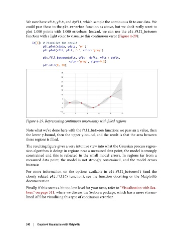
We now have xfit, yfit, and dyfit, which sample the continuous fit to our data. We
               could pass these to the plt.errorbar function as above, but we don’t really want to
               plot 1,000 points with 1,000 errorbars. Instead, we can use the plt.fill_between
               function with a light color to visualize this continuous error (Figure 4-29):
                   In[5]: # Visualize the result
                          plt.plot(xdata, ydata, 'or')
                          plt.plot(xfit, yfit, '-', color='gray')
                          plt.fill_between(xfit, yfit - dyfit, yfit + dyfit,
                                           color='gray', alpha=0.2)
                          plt.xlim(0, 10);


               Figure 4-29. Representing continuous uncertainty with filled regions

               Note what we’ve done here with the fill_between function: we pass an x value, then
               the lower y-bound, then the upper y-bound, and the result is that the area between
               these regions is filled.
               The resulting figure gives a very intuitive view into what the Gaussian process regres‐
               sion algorithm is doing: in regions near a measured data point, the model is strongly
               constrained and this is reflected in the small model errors. In regions far from a
               measured data point, the model is not strongly constrained, and the model errors
               increase.
               For more information on the options available in plt.fill_between()  (and the
               closely related plt.fill()  function), see the function docstring or the Matplotlib
               documentation.

               Finally, if this seems a bit too low level for your taste, refer to “Visualization with Sea‐
               born” on page 311, where we discuss the Seaborn package, which has a more stream‐
               lined API for visualizing this type of continuous errorbar.


               240  |  Chapter 4: Visualization with Matplotlib