
Page 253 - Python Data Science Handbook
P. 253
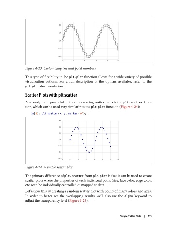
Figure 4-23. Customizing line and point numbers

               This type of flexibility in the plt.plot function allows for a wide variety of possible
               visualization options. For a full description of the options available, refer to the
               plt.plot documentation.

               Scatter Plots with plt.scatter

               A second, more powerful method of creating scatter plots is the plt.scatter func‐
               tion, which can be used very similarly to the plt.plot function (Figure 4-24):

                   In[6]: plt.scatter(x, y, marker='o');


               Figure 4-24. A simple scatter plot

               The primary difference of plt.scatter from plt.plot is that it can be used to create
               scatter plots where the properties of each individual point (size, face color, edge color,
               etc.) can be individually controlled or mapped to data.
               Let’s show this by creating a random scatter plot with points of many colors and sizes.
               In order to better see the overlapping results, we’ll also use the alpha  keyword to
               adjust the transparency level (Figure 4-25):


                                                                     Simple Scatter Plots  |  235