
Page 260 - Python Data Science Handbook
P. 260
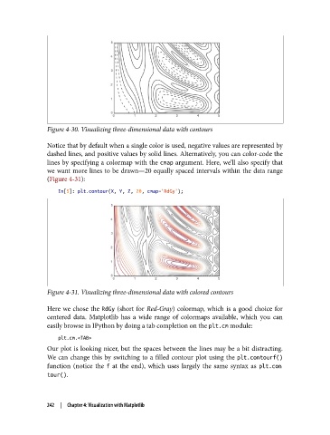
Figure 4-30. Visualizing three-dimensional data with contours

               Notice that by default when a single color is used, negative values are represented by
               dashed lines, and positive values by solid lines. Alternatively, you can color-code the
               lines by specifying a colormap with the cmap argument. Here, we’ll also specify that
               we want more lines to be drawn—20 equally spaced intervals within the data range
               (Figure 4-31):

                   In[5]: plt.contour(X, Y, Z, 20, cmap='RdGy');


               Figure 4-31. Visualizing three-dimensional data with colored contours

               Here we chose the RdGy  (short for Red-Gray) colormap, which is a good choice for
               centered data. Matplotlib has a wide range of colormaps available, which you can
               easily browse in IPython by doing a tab completion on the plt.cm module:

                   plt.cm.<TAB>
               Our plot is looking nicer, but the spaces between the lines may be a bit distracting.
               We can change this by switching to a filled contour plot using the plt.contourf()
               function (notice the f  at the end), which uses largely the same syntax as plt.con
               tour().


               242  |  Chapter 4: Visualization with Matplotlib