
Page 261 - Python Data Science Handbook
P. 261
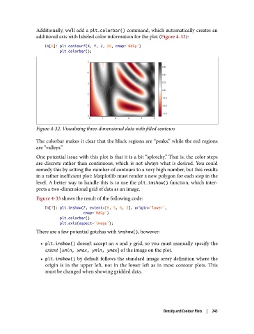
Additionally, we’ll add a plt.colorbar() command, which automatically creates an
               additional axis with labeled color information for the plot (Figure 4-32):

                   In[6]: plt.contourf(X, Y, Z, 20, cmap='RdGy')
                          plt.colorbar();


               Figure 4-32. Visualizing three-dimensional data with filled contours

               The colorbar makes it clear that the black regions are “peaks,” while the red regions
               are “valleys.”
               One potential issue with this plot is that it is a bit “splotchy.” That is, the color steps
               are discrete rather than continuous, which is not always what is desired. You could
               remedy this by setting the number of contours to a very high number, but this results
               in a rather inefficient plot: Matplotlib must render a new polygon for each step in the
               level. A better way to handle this is to use the plt.imshow()  function, which inter‐
               prets a two-dimensional grid of data as an image.
               Figure 4-33 shows the result of the following code:

                   In[7]: plt.imshow(Z, extent=[0, 5, 0, 5], origin='lower',
                                     cmap='RdGy')
                          plt.colorbar()
                          plt.axis(aspect='image');
               There are a few potential gotchas with imshow(), however:

                 • plt.imshow() doesn’t accept an x and y grid, so you must manually specify the
                   extent [xmin, xmax, ymin, ymax] of the image on the plot.
                 • plt.imshow()  by default follows the standard image array definition where the
                   origin is in the upper left, not in the lower left as in most contour plots. This
                   must be changed when showing gridded data.


                                                                  Density and Contour Plots  |  243