
Page 287 - Python Data Science Handbook
P. 287
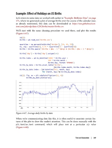
Example: Effect of Holidays on US Births

               Let’s return to some data we worked with earlier in “Example: Birthrate Data” on page
               174, where we generated a plot of average births over the course of the calendar year;
               as already mentioned, this data can be downloaded at https://raw.githubusercon
               tent.com/jakevdp/data-CDCbirths/master/births.csv.
               We’ll start with the same cleaning procedure we used there, and plot the results
               (Figure 4-67):
                   In[2]:
                   births = pd.read_csv('births.csv')
                   quartiles = np.percentile(births['births'], [25, 50, 75])
                   mu, sig = quartiles[1], 0.74 * (quartiles[2] - quartiles[0])
                   births = births.query('(births > @mu - 5 * @sig) & (births < @mu + 5 * @sig)')
                   births['day'] = births['day'].astype(int)

                   births.index = pd.to_datetime(10000 * births.year +
                                                 100 * births.month +
                                                 births.day, format='%Y%m%d')
                   births_by_date = births.pivot_table('births',
                                                       [births.index.month, births.index.day])
                   births_by_date.index = [pd.datetime(2012, month, day)
                                           for (month, day) in births_by_date.index]
                   In[3]: fig, ax = plt.subplots(figsize=(12, 4))
                          births_by_date.plot(ax=ax);


               Figure 4-67. Average daily births by date

               When we’re communicating data like this, it is often useful to annotate certain fea‐
               tures of the plot to draw the reader’s attention. This can be done manually with the
               plt.text/ax.text  command, which will place text at a particular x/y  value
               (Figure 4-68):


                                                                     Text and Annotation  |  269