
Page 286 - Python Data Science Handbook
P. 286
y_hist.hist(y, 40, histtype='stepfilled',
orientation='horizontal', color='gray')
y_hist.invert_xaxis()
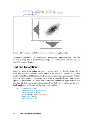
Figure 4-66. Visualizing multidimensional distributions with plt.GridSpec
This type of distribution plotted alongside its margins is common enough that it has
its own plotting API in the Seaborn package; see “Visualization with Seaborn” on
page 311 for more details.
Text and Annotation
Creating a good visualization involves guiding the reader so that the figure tells a
story. In some cases, this story can be told in an entirely visual manner, without the
need for added text, but in others, small textual cues and labels are necessary. Perhaps
the most basic types of annotations you will use are axes labels and titles, but the
options go beyond this. Let’s take a look at some data and how we might visualize and
annotate it to help convey interesting information. We’ll start by setting up the note‐
book for plotting and importing the functions we will use:
In[1]: %matplotlib inline
import matplotlib.pyplot as plt
import matplotlib as mpl
plt.style.use('seaborn-whitegrid')
import numpy as np
import pandas as pd
268 | Chapter 4: Visualization with Matplotlib