
Page 334 - Python Data Science Handbook
P. 334
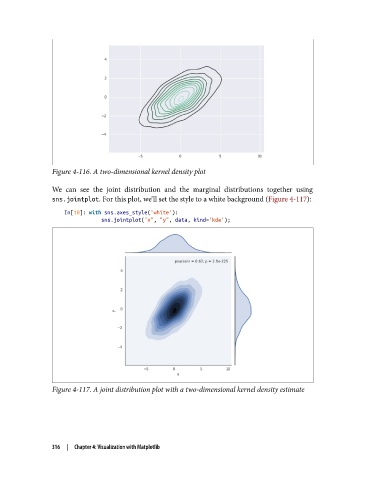
Figure 4-116. A two-dimensional kernel density plot

               We can see the joint distribution and the marginal distributions together using
               sns.jointplot. For this plot, we’ll set the style to a white background (Figure 4-117):

                   In[10]: with sns.axes_style('white'):
                               sns.jointplot("x", "y", data, kind='kde');


               Figure 4-117. A joint distribution plot with a two-dimensional kernel density estimate


               316  |  Chapter 4: Visualization with Matplotlib