
Page 335 - Python Data Science Handbook
P. 335
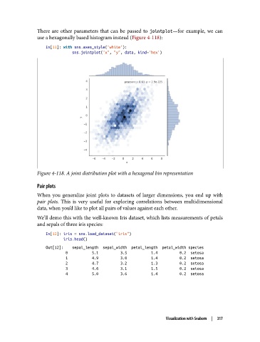
There are other parameters that can be passed to jointplot—for example, we can
               use a hexagonally based histogram instead (Figure 4-118):

                   In[11]: with sns.axes_style('white'):
                               sns.jointplot("x", "y", data, kind='hex')


               Figure 4-118. A joint distribution plot with a hexagonal bin representation

               Pair plots
               When you generalize joint plots to datasets of larger dimensions, you end up with
               pair plots. This is very useful for exploring correlations between multidimensional
               data, when you’d like to plot all pairs of values against each other.

               We’ll demo this with the well-known Iris dataset, which lists measurements of petals
               and sepals of three iris species:

                   In[12]: iris = sns.load_dataset("iris")
                           iris.head()
                   Out[12]:    sepal_length  sepal_width  petal_length  petal_width species
                            0           5.1          3.5           1.4          0.2  setosa
                            1           4.9          3.0           1.4          0.2  setosa
                            2           4.7          3.2           1.3          0.2  setosa
                            3           4.6          3.1           1.5          0.2  setosa
                            4           5.0          3.6           1.4          0.2  setosa


                                                                 Visualization with Seaborn  |  317