
Page 338 - Python Data Science Handbook
P. 338
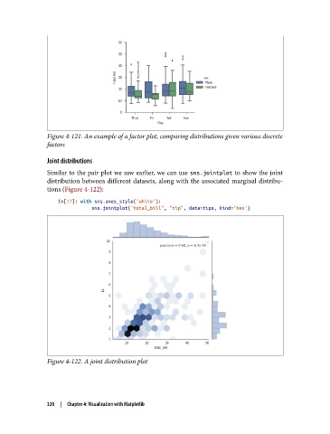
Figure 4-121. An example of a factor plot, comparing distributions given various discrete
               factors

               Joint distributions
               Similar to the pair plot we saw earlier, we can use sns.jointplot to show the joint
               distribution between different datasets, along with the associated marginal distribu‐
               tions (Figure 4-122):

                   In[17]: with sns.axes_style('white'):
                               sns.jointplot("total_bill", "tip", data=tips, kind='hex')


               Figure 4-122. A joint distribution plot


               320  |  Chapter 4: Visualization with Matplotlib