
Page 453 - Python Data Science Handbook
P. 453
plt.scatter(X[:, 0], X[:, 1], alpha=0.2)
for length, vector in zip(pca.explained_variance_, pca.components_):
v = vector * 3 * np.sqrt(length)
draw_vector(pca.mean_, pca.mean_ + v)
plt.axis('equal');
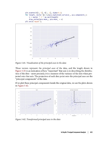
Figure 5-81. Visualization of the principal axes in the data
These vectors represent the principal axes of the data, and the length shown in
Figure 5-81 is an indication of how “important” that axis is in describing the distribu‐
tion of the data—more precisely, it is a measure of the variance of the data when pro‐
jected onto that axis. The projection of each data point onto the principal axes are the
“principal components” of the data.
If we plot these principal components beside the original data, we see the plots shown
in Figure 5-82.
Figure 5-82. Transformed principal axes in the data
In Depth: Principal Component Analysis | 435