
Page 455 - Python Data Science Handbook
P. 455
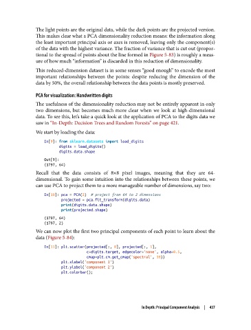
The light points are the original data, while the dark points are the projected version.
               This makes clear what a PCA dimensionality reduction means: the information along
               the least important principal axis or axes is removed, leaving only the component(s)
               of the data with the highest variance. The fraction of variance that is cut out (propor‐
               tional to the spread of points about the line formed in Figure 5-83) is roughly a meas‐
               ure of how much “information” is discarded in this reduction of dimensionality.

               This reduced-dimension dataset is in some senses “good enough” to encode the most
               important relationships between the points: despite reducing the dimension of the
               data by 50%, the overall relationship between the data points is mostly preserved.

               PCA for visualization: Handwritten digits
               The usefulness of the dimensionality reduction may not be entirely apparent in only
               two dimensions, but becomes much more clear when we look at high-dimensional
               data. To see this, let’s take a quick look at the application of PCA to the digits data we
               saw in “In-Depth: Decision Trees and Random Forests” on page 421.
               We start by loading the data:

                   In[9]: from sklearn.datasets import load_digits
                          digits = load_digits()
                          digits.data.shape

                   Out[9]:
                   (1797, 64)
               Recall that the data consists of 8×8 pixel images, meaning that they are 64-
               dimensional. To gain some intuition into the relationships between these points, we
               can use PCA to project them to a more manageable number of dimensions, say two:
                   In[10]: pca = PCA(2)  # project from 64 to 2 dimensions
                           projected = pca.fit_transform(digits.data)
                           print(digits.data.shape)
                           print(projected.shape)
                   (1797, 64)
                   (1797, 2)
               We can now plot the first two principal components of each point to learn about the
               data (Figure 5-84):
                   In[11]: plt.scatter(projected[:, 0], projected[:, 1],
                                       c=digits.target, edgecolor='none', alpha=0.5,
                                       cmap=plt.cm.get_cmap('spectral', 10))
                           plt.xlabel('component 1')
                           plt.ylabel('component 2')
                           plt.colorbar();


                                                          In Depth: Principal Component Analysis  |  437