
Page 482 - Python Data Science Handbook
P. 482
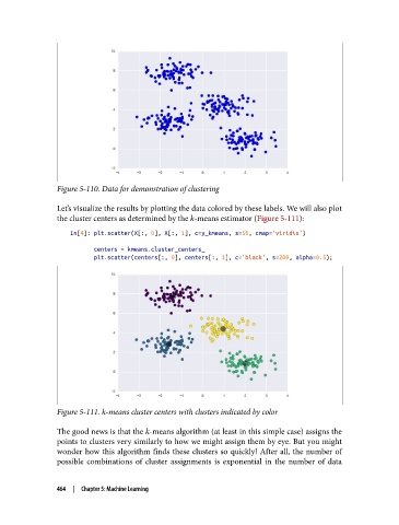
Figure 5-110. Data for demonstration of clustering

               Let’s visualize the results by plotting the data colored by these labels. We will also plot
               the cluster centers as determined by the k-means estimator (Figure 5-111):
                   In[4]: plt.scatter(X[:, 0], X[:, 1], c=y_kmeans, s=50, cmap='viridis')

                          centers = kmeans.cluster_centers_
                          plt.scatter(centers[:, 0], centers[:, 1], c='black', s=200, alpha=0.5);


               Figure 5-111. k-means cluster centers with clusters indicated by color

               The good news is that the k-means algorithm (at least in this simple case) assigns the
               points to clusters very similarly to how we might assign them by eye. But you might
               wonder how this algorithm finds these clusters so quickly! After all, the number of
               possible combinations of cluster assignments is exponential in the number of data


               464  |  Chapter 5: Machine Learning