
Page 222 - Python Data Science Handbook
P. 222
Visualizing the data
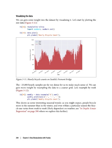
We can gain some insight into the dataset by visualizing it. Let’s start by plotting the
raw data (Figure 3-11):
In[38]: %matplotlib inline
import seaborn; seaborn.set()
In[39]: data.plot()
plt.ylabel('Hourly Bicycle Count');
Figure 3-11. Hourly bicycle counts on Seattle’s Fremont bridge
The ~25,000 hourly samples are far too dense for us to make much sense of. We can
gain more insight by resampling the data to a coarser grid. Let’s resample by week
(Figure 3-12):
In[40]: weekly = data.resample('W').sum()
weekly.plot(style=[':', '--', '-'])
plt.ylabel('Weekly bicycle count');
This shows us some interesting seasonal trends: as you might expect, people bicycle
more in the summer than in the winter, and even within a particular season the bicy‐
cle use varies from week to week (likely dependent on weather; see “In Depth: Linear
Regression” on page 390 where we explore this further).
204 | Chapter 3: Data Manipulation with Pandas