
Page 224 - Python Data Science Handbook
P. 224
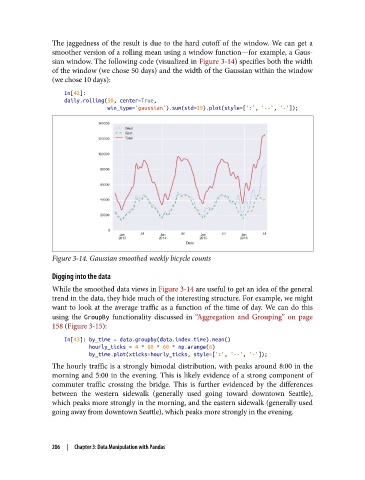
The jaggedness of the result is due to the hard cutoff of the window. We can get a
               smoother version of a rolling mean using a window function—for example, a Gaus‐
               sian window. The following code (visualized in Figure 3-14) specifies both the width
               of the window (we chose 50 days) and the width of the Gaussian within the window
               (we chose 10 days):

                   In[42]:
                   daily.rolling(50, center=True,
                                 win_type='gaussian').sum(std=10).plot(style=[':', '--', '-']);


               Figure 3-14. Gaussian smoothed weekly bicycle counts

               Digging into the data
               While the smoothed data views in Figure 3-14 are useful to get an idea of the general
               trend in the data, they hide much of the interesting structure. For example, we might
               want to look at the average traffic as a function of the time of day. We can do this
               using the GroupBy  functionality discussed in “Aggregation and Grouping” on page
               158 (Figure 3-15):

                   In[43]: by_time = data.groupby(data.index.time).mean()
                           hourly_ticks = 4 * 60 * 60 * np.arange(6)
                           by_time.plot(xticks=hourly_ticks, style=[':', '--', '-']);
               The hourly traffic is a strongly bimodal distribution, with peaks around 8:00 in the
               morning and 5:00 in the evening. This is likely evidence of a strong component of
               commuter traffic crossing the bridge. This is further evidenced by the differences
               between the western sidewalk (generally used going toward downtown Seattle),
               which peaks more strongly in the morning, and the eastern sidewalk (generally used
               going away from downtown Seattle), which peaks more strongly in the evening.


               206  |  Chapter 3: Data Manipulation with Pandas