
Page 242 - Python Data Science Handbook
P. 242
Simple Line Plots
Perhaps the simplest of all plots is the visualization of a single function y = f x . Here
we will take a first look at creating a simple plot of this type. As with all the following
sections, we’ll start by setting up the notebook for plotting and importing the func‐
tions we will use:
In[1]: %matplotlib inline
import matplotlib.pyplot as plt
plt.style.use('seaborn-whitegrid')
import numpy as np
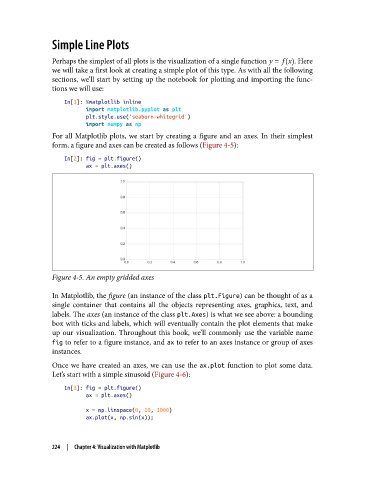
For all Matplotlib plots, we start by creating a figure and an axes. In their simplest
form, a figure and axes can be created as follows (Figure 4-5):
In[2]: fig = plt.figure()
ax = plt.axes()
Figure 4-5. An empty gridded axes
In Matplotlib, the figure (an instance of the class plt.Figure) can be thought of as a
single container that contains all the objects representing axes, graphics, text, and
labels. The axes (an instance of the class plt.Axes) is what we see above: a bounding
box with ticks and labels, which will eventually contain the plot elements that make
up our visualization. Throughout this book, we’ll commonly use the variable name
fig to refer to a figure instance, and ax to refer to an axes instance or group of axes
instances.
Once we have created an axes, we can use the ax.plot function to plot some data.
Let’s start with a simple sinusoid (Figure 4-6):
In[3]: fig = plt.figure()
ax = plt.axes()
x = np.linspace(0, 10, 1000)
ax.plot(x, np.sin(x));
224 | Chapter 4: Visualization with Matplotlib