
Page 246 - Python Data Science Handbook
P. 246
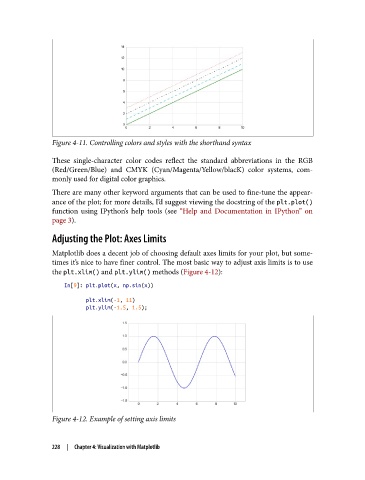
Figure 4-11. Controlling colors and styles with the shorthand syntax

               These single-character color codes reflect the standard abbreviations in the RGB
               (Red/Green/Blue) and CMYK (Cyan/Magenta/Yellow/blacK) color systems, com‐
               monly used for digital color graphics.
               There are many other keyword arguments that can be used to fine-tune the appear‐
               ance of the plot; for more details, I’d suggest viewing the docstring of the plt.plot()
               function using IPython’s help tools (see “Help and Documentation in IPython”  on
               page 3).

               Adjusting the Plot: Axes Limits

               Matplotlib does a decent job of choosing default axes limits for your plot, but some‐
               times it’s nice to have finer control. The most basic way to adjust axis limits is to use
               the plt.xlim() and plt.ylim() methods (Figure 4-12):

                   In[9]: plt.plot(x, np.sin(x))
                          plt.xlim(-1, 11)
                          plt.ylim(-1.5, 1.5);


               Figure 4-12. Example of setting axis limits


               228  |  Chapter 4: Visualization with Matplotlib