
Page 244 - Python Data Science Handbook
P. 244
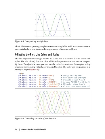
Figure 4-8. Over-plotting multiple lines

               That’s all there is to plotting simple functions in Matplotlib! We’ll now dive into some
               more details about how to control the appearance of the axes and lines.

               Adjusting the Plot: Line Colors and Styles

               The first adjustment you might wish to make to a plot is to control the line colors and
               styles. The plt.plot() function takes additional arguments that can be used to spec‐
               ify these. To adjust the color, you can use the color keyword, which accepts a string
               argument representing virtually any imaginable color. The color can be specified in a
               variety of ways (Figure 4-9):

                   In[6]:
                   plt.plot(x, np.sin(x - 0), color='blue')        # specify color by name
                   plt.plot(x, np.sin(x - 1), color='g')           # short color code (rgbcmyk)
                   plt.plot(x, np.sin(x - 2), color='0.75')        # Grayscale between 0 and 1
                   plt.plot(x, np.sin(x - 3), color='#FFDD44')     # Hex code (RRGGBB from 00 to FF)
                   plt.plot(x, np.sin(x - 4), color=(1.0,0.2,0.3)) # RGB tuple, values 0 and 1
                   plt.plot(x, np.sin(x - 5), color='chartreuse'); # all HTML color names supported


               Figure 4-9. Controlling the color of plot elements


               226  |  Chapter 4: Visualization with Matplotlib