
Page 248 - Python Data Science Handbook
P. 248
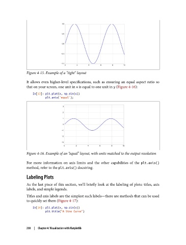
Figure 4-15. Example of a “tight” layout

               It allows even higher-level specifications, such as ensuring an equal aspect ratio so
               that on your screen, one unit in x is equal to one unit in y (Figure 4-16):

                   In[13]: plt.plot(x, np.sin(x))
                           plt.axis('equal');


               Figure 4-16. Example of an “equal” layout, with units matched to the output resolution

               For more information on axis limits and the other capabilities of the plt.axis()
               method, refer to the plt.axis() docstring.
               Labeling Plots

               As the last piece of this section, we’ll briefly look at the labeling of plots: titles, axis
               labels, and simple legends.
               Titles and axis labels are the simplest such labels—there are methods that can be used
               to quickly set them (Figure 4-17):

                   In[14]: plt.plot(x, np.sin(x))
                           plt.title("A Sine Curve")


               230  |  Chapter 4: Visualization with Matplotlib