
Page 267 - Python Data Science Handbook
P. 267
# Plot the result as an image
plt.imshow(Z.reshape(Xgrid.shape),
origin='lower', aspect='auto',
extent=[-3.5, 3.5, -6, 6],
cmap='Blues')
cb = plt.colorbar()
cb.set_label("density")
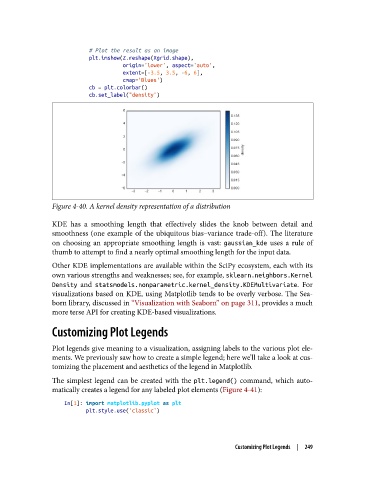
Figure 4-40. A kernel density representation of a distribution
KDE has a smoothing length that effectively slides the knob between detail and
smoothness (one example of the ubiquitous bias–variance trade-off). The literature
on choosing an appropriate smoothing length is vast: gaussian_kde uses a rule of
thumb to attempt to find a nearly optimal smoothing length for the input data.
Other KDE implementations are available within the SciPy ecosystem, each with its
own various strengths and weaknesses; see, for example, sklearn.neighbors.Kernel
Density and statsmodels.nonparametric.kernel_density.KDEMultivariate. For
visualizations based on KDE, using Matplotlib tends to be overly verbose. The Sea‐
born library, discussed in “Visualization with Seaborn” on page 311, provides a much
more terse API for creating KDE-based visualizations.
Customizing Plot Legends
Plot legends give meaning to a visualization, assigning labels to the various plot ele‐
ments. We previously saw how to create a simple legend; here we’ll take a look at cus‐
tomizing the placement and aesthetics of the legend in Matplotlib.
The simplest legend can be created with the plt.legend() command, which auto‐
matically creates a legend for any labeled plot elements (Figure 4-41):
In[1]: import matplotlib.pyplot as plt
plt.style.use('classic')
Customizing Plot Legends | 249