
Page 268 - Python Data Science Handbook
P. 268
In[2]: %matplotlib inline
import numpy as np
In[3]: x = np.linspace(0, 10, 1000)
fig, ax = plt.subplots()
ax.plot(x, np.sin(x), '-b', label='Sine')
ax.plot(x, np.cos(x), '--r', label='Cosine')
ax.axis('equal')
leg = ax.legend();
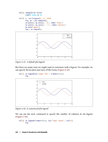
Figure 4-41. A default plot legend
But there are many ways we might want to customize such a legend. For example, we
can specify the location and turn off the frame (Figure 4-42):
In[4]: ax.legend(loc='upper left', frameon=False)
fig
Figure 4-42. A customized plot legend
We can use the ncol command to specify the number of columns in the legend
(Figure 4-43):
In[5]: ax.legend(frameon=False, loc='lower center', ncol=2)
fig
250 | Chapter 4: Visualization with Matplotlib