Page 272 - Python Data Science Handbook
P. 272
By plotting empty lists, we create labeled plot objects that are picked up by the legend,
               and now our legend tells us some useful information. This strategy can be useful for
               creating more sophisticated visualizations.
               Finally, note that for geographic data like this, it would be clearer if we could show
               state boundaries or other map-specific elements. For this, an excellent choice of tool
               is Matplotlib’s Basemap add-on toolkit, which we’ll explore in “Geographic Data with
               Basemap” on page 298.

               Multiple Legends
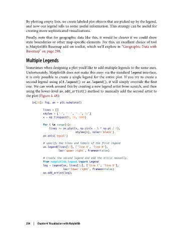
               Sometimes when designing a plot you’d like to add multiple legends to the same axes.
               Unfortunately, Matplotlib does not make this easy: via the standard legend interface,
               it is only possible to create a single legend for the entire plot. If you try to create a
               second legend using plt.legend()  or ax.legend(), it will simply override the first
               one. We can work around this by creating a new legend artist from scratch, and then
               using the lower-level ax.add_artist() method to manually add the second artist to
               the plot (Figure 4-48):

                   In[10]: fig, ax = plt.subplots()
                          lines = []
                          styles = ['-', '--', '-.', ':']
                          x = np.linspace(0, 10, 1000)
                          for i in range(4):
                              lines += ax.plot(x, np.sin(x - i * np.pi / 2),
                                               styles[i], color='black')
                          ax.axis('equal')

                          # specify the lines and labels of the first legend
                          ax.legend(lines[:2], ['line A', 'line B'],
                                    loc='upper right', frameon=False)

                          # Create the second legend and add the artist manually.
                          from matplotlib.legend import Legend
                          leg = Legend(ax, lines[2:], ['line C', 'line D'],
                                       loc='lower right', frameon=False)
                          ax.add_artist(leg);


               254  |  Chapter 4: Visualization with Matplotlib

