
Page 271 - Python Data Science Handbook
P. 271
scale of the sizes of the points, and we’ll accomplish this by plotting some labeled data
with no entries (Figure 4-47):
In[9]: import pandas as pd
cities = pd.read_csv('data/california_cities.csv')
# Extract the data we're interested in
lat, lon = cities['latd'], cities['longd']
population, area = cities['population_total'], cities['area_total_km2']
# Scatter the points, using size and color but no label
plt.scatter(lon, lat, label=None,
c=np.log10(population), cmap='viridis',
s=area, linewidth=0, alpha=0.5)
plt.axis(aspect='equal')
plt.xlabel('longitude')
plt.ylabel('latitude')
plt.colorbar(label='log$_{10}$(population)')
plt.clim(3, 7)
# Here we create a legend:
# we'll plot empty lists with the desired size and label
for area in [100, 300, 500]:
plt.scatter([], [], c='k', alpha=0.3, s=area,
label=str(area) + ' km$^2$')
plt.legend(scatterpoints=1, frameon=False,
labelspacing=1, title='City Area')
plt.title('California Cities: Area and Population');
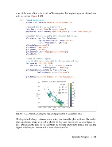
Figure 4-47. Location, geographic size, and population of California cities
The legend will always reference some object that is on the plot, so if we’d like to dis‐
play a particular shape we need to plot it. In this case, the objects we want (gray cir‐
cles) are not on the plot, so we fake them by plotting empty lists. Notice too that the
legend only lists plot elements that have a label specified.
Customizing Plot Legends | 253