
Page 273 - Python Data Science Handbook
P. 273
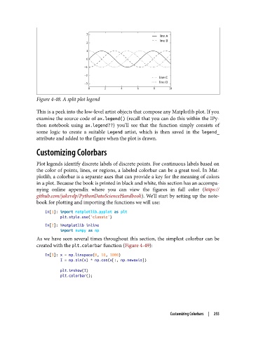
Figure 4-48. A split plot legend

               This is a peek into the low-level artist objects that compose any Matplotlib plot. If you
               examine the source code of ax.legend() (recall that you can do this within the IPy‐
               thon notebook using ax.legend??) you’ll see that the function simply consists of
               some logic to create a suitable Legend  artist, which is then saved in the legend_
               attribute and added to the figure when the plot is drawn.

               Customizing Colorbars

               Plot legends identify discrete labels of discrete points. For continuous labels based on
               the color of points, lines, or regions, a labeled colorbar can be a great tool. In Mat‐
               plotlib, a colorbar is a separate axes that can provide a key for the meaning of colors
               in a plot. Because the book is printed in black and white, this section has an accompa‐
               nying online appendix where you can view the figures in full color (https://
               github.com/jakevdp/PythonDataScienceHandbook). We’ll start by setting up the note‐
               book for plotting and importing the functions we will use:
                   In[1]: import matplotlib.pyplot as plt
                          plt.style.use('classic')
                   In[2]: %matplotlib inline
                          import numpy as np
               As we have seen several times throughout this section, the simplest colorbar can be
               created with the plt.colorbar function (Figure 4-49):

                   In[3]: x = np.linspace(0, 10, 1000)
                          I = np.sin(x) * np.cos(x[:, np.newaxis])

                          plt.imshow(I)
                          plt.colorbar();


                                                                    Customizing Colorbars  |  255