
Page 276 - Python Data Science Handbook
P. 276
fig, ax = plt.subplots(2, figsize=(6, 2),
subplot_kw=dict(xticks=[], yticks=[]))
ax[0].imshow([colors], extent=[0, 10, 0, 1])
ax[1].imshow([grayscale], extent=[0, 10, 0, 1])
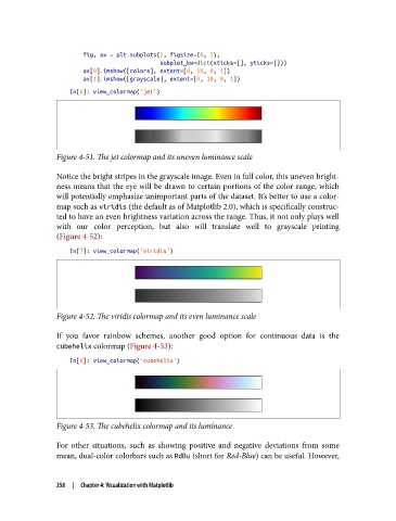
In[6]: view_colormap('jet')
Figure 4-51. The jet colormap and its uneven luminance scale
Notice the bright stripes in the grayscale image. Even in full color, this uneven bright‐
ness means that the eye will be drawn to certain portions of the color range, which
will potentially emphasize unimportant parts of the dataset. It’s better to use a color‐
map such as viridis (the default as of Matplotlib 2.0), which is specifically construc‐
ted to have an even brightness variation across the range. Thus, it not only plays well
with our color perception, but also will translate well to grayscale printing
(Figure 4-52):
In[7]: view_colormap('viridis')
Figure 4-52. The viridis colormap and its even luminance scale
If you favor rainbow schemes, another good option for continuous data is the
cubehelix colormap (Figure 4-53):
In[8]: view_colormap('cubehelix')
Figure 4-53. The cubehelix colormap and its luminance
For other situations, such as showing positive and negative deviations from some
mean, dual-color colorbars such as RdBu (short for Red-Blue) can be useful. However,
258 | Chapter 4: Visualization with Matplotlib