
Page 277 - Python Data Science Handbook
P. 277
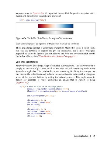
as you can see in Figure 4-54, it’s important to note that the positive-negative infor‐
               mation will be lost upon translation to grayscale!

                   In[9]: view_colormap('RdBu')


               Figure 4-54. The RdBu (Red-Blue) colormap and its luminance

               We’ll see examples of using some of these color maps as we continue.
               There are a large number of colormaps available in Matplotlib; to see a list of them,
               you can use IPython to explore the plt.cm  submodule. For a more principled
               approach to colors in Python, you can refer to the tools and documentation within
               the Seaborn library (see “Visualization with Seaborn” on page 311).

               Color limits and extensions
               Matplotlib allows for a large range of colorbar customization. The colorbar itself is
               simply an instance of plt.Axes, so all of the axes and tick formatting tricks we’ve
               learned are applicable. The colorbar has some interesting flexibility; for example, we
               can narrow the color limits and indicate the out-of-bounds values with a triangular
               arrow at the top and bottom by setting the extend  property. This might come in
               handy, for example, if you’re displaying an image that is subject to noise
               (Figure 4-55):
                   In[10]: # make noise in 1% of the image pixels
                           speckles = (np.random.random(I.shape) < 0.01)
                           I[speckles] = np.random.normal(0, 3, np.count_nonzero(speckles))

                           plt.figure(figsize=(10, 3.5))
                           plt.subplot(1, 2, 1)
                           plt.imshow(I, cmap='RdBu')
                           plt.colorbar()
                           plt.subplot(1, 2, 2)
                           plt.imshow(I, cmap='RdBu')
                           plt.colorbar(extend='both')
                           plt.clim(-1, 1);


                                                                    Customizing Colorbars  |  259