
Page 280 - Python Data Science Handbook
P. 280
In[13]: # project the digits into 2 dimensions using IsoMap
from sklearn.manifold import Isomap
iso = Isomap(n_components=2)
projection = iso.fit_transform(digits.data)
We’ll use our discrete colormap to view the results, setting the ticks and clim to
improve the aesthetics of the resulting colorbar (Figure 4-58):
In[14]: # plot the results
plt.scatter(projection[:, 0], projection[:, 1], lw=0.1,
c=digits.target, cmap=plt.cm.get_cmap('cubehelix', 6))
plt.colorbar(ticks=range(6), label='digit value')
plt.clim(-0.5, 5.5)
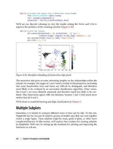
Figure 4-58. Manifold embedding of handwritten digit pixels
The projection also gives us some interesting insights on the relationships within the
dataset: for example, the ranges of 5 and 3 nearly overlap in this projection, indicating
that some handwritten fives and threes are difficult to distinguish, and therefore
more likely to be confused by an automated classification algorithm. Other values,
like 0 and 1, are more distantly separated, and therefore much less likely to be con‐
fused. This observation agrees with our intuition, because 5 and 3 look much more
similar than do 0 and 1.
We’ll return to manifold learning and digit classification in Chapter 5.
Multiple Subplots
Sometimes it is helpful to compare different views of data side by side. To this end,
Matplotlib has the concept of subplots: groups of smaller axes that can exist together
within a single figure. These subplots might be insets, grids of plots, or other more
complicated layouts. In this section, we’ll explore four routines for creating subplots
in Matplotlib. We’ll start by setting up the notebook for plotting and importing the
functions we will use:
262 | Chapter 4: Visualization with Matplotlib