
Page 337 - Python Data Science Handbook
P. 337
3 23.68 3.31 Male No Sun Dinner 2
4 24.59 3.61 Female No Sun Dinner 4
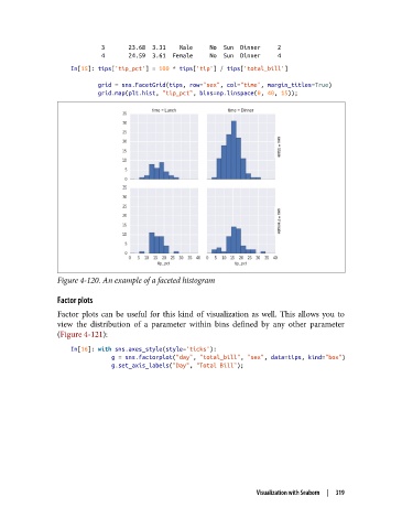
In[15]: tips['tip_pct'] = 100 * tips['tip'] / tips['total_bill']
grid = sns.FacetGrid(tips, row="sex", col="time", margin_titles=True)
grid.map(plt.hist, "tip_pct", bins=np.linspace(0, 40, 15));
Figure 4-120. An example of a faceted histogram
Factor plots
Factor plots can be useful for this kind of visualization as well. This allows you to
view the distribution of a parameter within bins defined by any other parameter
(Figure 4-121):
In[16]: with sns.axes_style(style='ticks'):
g = sns.factorplot("day", "total_bill", "sex", data=tips, kind="box")
g.set_axis_labels("Day", "Total Bill");
Visualization with Seaborn | 319