
Page 336 - Python Data Science Handbook
P. 336
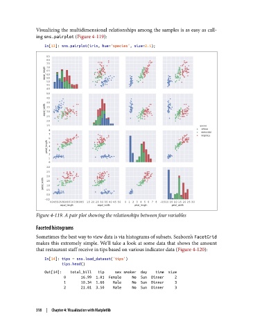
Visualizing the multidimensional relationships among the samples is as easy as call‐
               ing sns.pairplot (Figure 4-119):

                   In[13]: sns.pairplot(iris, hue='species', size=2.5);


               Figure 4-119. A pair plot showing the relationships between four variables


               Faceted histograms
               Sometimes the best way to view data is via histograms of subsets. Seaborn’s FacetGrid
               makes this extremely simple. We’ll take a look at some data that shows the amount
               that restaurant staff receive in tips based on various indicator data (Figure 4-120):

                   In[14]: tips = sns.load_dataset('tips')
                           tips.head()
                   Out[14]:    total_bill   tip     sex smoker  day    time  size
                            0       16.99  1.01  Female     No  Sun  Dinner     2
                            1       10.34  1.66    Male     No  Sun  Dinner     3
                            2       21.01  3.50    Male     No  Sun  Dinner     3


               318  |  Chapter 4: Visualization with Matplotlib